Festival Design 2012
Festival Design 2012
Working with the "Promised Land" idea, the significant reference pictures the sky, the heaven, the admirable thing beyond us. Translating this connotation into a unique material, The Laboratory of Manue Bürger was using metal-coated paper (from the eastern side of the globe) that shines not only golden, it also reflects rainbow colors, so to say: attracts attention on a very high level. The design of a centered black tunnel with its rounded (!) worth pursuing rectangle at the horizon, shows the gesture of our compulsion and drive for contemporary technology. It questions the relationship of the striving human rather user as in/compatible part in our glowing digital culture. Shineyness vs. black vacuum of shallow promises generate the "techno-cultural-uneasy" effect, that connects directly to transmediale's exhibition "Dark Drives".
"PROMISED LAND" - the design approach
Hope and Promises on Digital Culture
The high exspectation on digital technology and its everyhour usage illustrate not only an irreplacable need, it rather points out a promise for infinite compatibility that determines our fortune. Cloud computing is only the beginning, High Definition is not the end. Technology heads towards utopia, or at least what people think it would be, an avantgardistic idea of technology & life. In/compatibility is a feature to generate money not the starting point for an artistic practice as transmediale is manifesting it for this year's festival.
(Self) Reflection in the Age of In/Compatibility
Our latest acquaintance with technology implicit full (self)reflection in our representation through social networks = on the internet. The cloud urges us spreading its idea, participating everywhere and for everything, becoming the role model of a digital naitive. Narcissm amd emancipation, so to say our performance builds up on fast chanels and its shineyness makes it attractive and adorable - ready for attention from all over. The design approach mirrors the self awarness in times of sacrification of technology and reveals its single-minded blindness.
Contemporary Aestehtics of Compatibility
Welcome to the world of slick softness, smooth shadows & fantastic fadings. If you want to join the sophisticated, proper digital life, you have to deal with an inevitable tactile-design style. Introduced by Apple there are no sharp rectangles anymore (beside this website...) Your Home icon is not anymore a triangle shaped roof, it’s a rounded rectangle.
Enlightment and spiritual grammar
Sacrifying technology goes from subtle gestures (handy bumper) to almost religious forms (Spirit Surfers). For all reasons at the end stands information rather enlightment. Pro Surfer Kevin Bewersdorf sees a BOON “at the eureka moment of a surf when the surfer becomes enlightened by the INFOspirit.“ Another spirtual form of sacrifiny technology is just the self representation of Richard Matthew Stallman, an American software freedom activist and computer programmer, which sees himself as missionary of the CPU world.
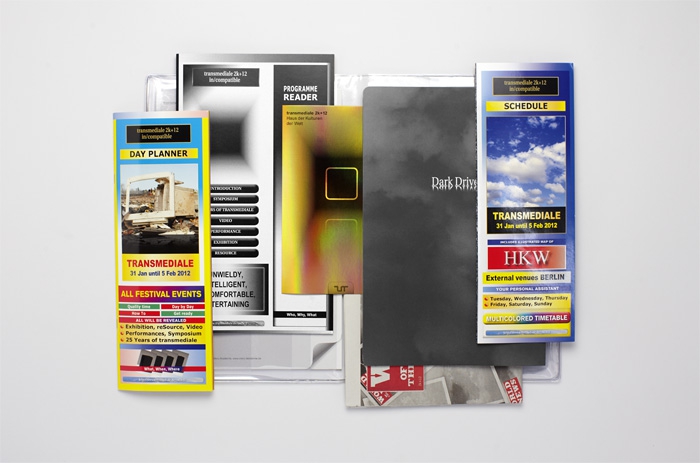
The FESTIVAL CATALOGUE with its shiny appearance contains 1.Programm Reader, 2. Day Planner, 3. Schedule & Location Map, 4. "Dark Drives" Exhibition Catalogue, 5. In/compatible notepad, 6. reSource research newspaper. The transparent pvc folder features different pockets on the inside, to organize all printed matter. A compatible system for in/compatible products...
Programm Reader: Showing the conceptual basis of the festival, its programme highlights and participants, the 32 pages black and white brochure looks like a symbiosis of early dtp design approaches with latest forms of digital life stlye. This clash leaves the reader in an blurry environment that is to be explored attentively. "The too old and the too new are two sides of the same coin: nothing ever works perfectly." Excerpt of the curatorial statement, p.3
Day Planner: Taking its inspiration from advertising leaflets and the infotainment design of "General Knowledge" (India) all festival events fight for their attention in order to be visit. "In the spirit of the festival theme, in/compatible, the following days will take you on a journey through phenomena that do not work togehter, therby forcing us to seek out alternative trajectories. Good Luck exploring." Excerpt of the intro, p.1
"Dark Drives" Exhibition Catalogue: With its gloomy look and white type on dark background, the "Dark Drives" catalogue translates the concept of the exibition on paper. The minimal design comes with a smart idea to emphasize the tension fields/ uneasy energies in a subtle way and influences our reading softly. Every line/row of the catalogue is set rotational in the typefaces: Times New Roman, Georgia, Utopia, Times New Roman,...
Schedule & Map: Fetishising the technology look over and over - this leaflet is an in/compatible experience. It features various timetables and maps and defines shineyness on a new level.
Offical Festival Trailer: The posing gestures of young rioters fitted to the gesture of our "black tunnel - golden technology" design. It became to the shortes festival trailer (counting only 15 seconds + credits), but also to the toughest one!
Homepage for TM2k+12: The controversial discussed homepage of transmediale festival shines bright and links to the design of the schedule/ daily planner. An advertising character: golden elements, repeating of images and the use of various typefaces generates a coincidence of in/compatible perception, the uneasyness of consumption.
Festival design by The Laboratory of Manuel Bürger.


