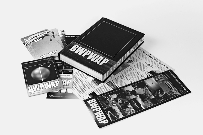
Festival Design 2013
Festival Design 2013
"The Ease of Creation" - BWPWAP Design Concept
The imagery of transmediale 2013 BWPWAP particularly reflects the contemporary phenomenon of recontextualisation in internet-user culture. The lively and quick exchange of memes, the creation of tiny entities of information and their constant change overs involve a certain ability of association, the possibility to deal with the complexity of a reference jungle. This leads to a fascinating semantic diversity of the web's communication nowadays.
The design of this transmediale issue uses mentioned strategies of appropriation and aesthetics of the meme culture (e.g. Impact font, remix and collage strategies) to create an own visual world mostly by involving old picture material of a closed archive (Golden Voyager Record Pictures), which wasn't use in the scenery of recontextualisation yet. The clash of fast feedback aesthetics and black and white imagery of former times questions the ongoing reconfiguration of cultural values & production. Do we have time to think about this?
The BWPWAP Website feat. Erik
Erik was the beloved and also very hated avatar of the BWPWAP website who entertained and annoyed people by his appearance (visual+audio) in the top of the website – he also appeard in the book & on flyers actually. Similar than "Condescending Wonka" he knew just too much. Speaking about the design: Its idea is based on the creation of an atypical retro-future look and feel. The website uses again the archive of the Golden Voyager Record to generate the retro feeling and combines these elements with contemporary web/meme aesthetics: see the acronyms of the single events overlaying the pictures etc. In terms of navigation the event-details were designed in neon colors to help overlooking the festival threads "Networks, Users, Paper, Desire".
A short introduction to the reference- jungle of BWPWAP – Back When Pluto Was A Planet
1. Pluto
From a visual point of view the dwarf planet Pluto is hard to catch. There are very less photographs around – just also only in thumb size. We used a computer simulation and pumped it up - a blurry place to put cultural imaginaries on.
2. After<>Before
"Let's go BWPWAP: Using the past as a medium to refract the present and reimagine future cultural practices." Erik.
The switch of the Before-After schema to After-Before supports this effort.
3. The Meme
The recontextualisation is one of the the basic ideas of the meme-culture. It provides the possibility to think easily in new directions by estranging signifiers from their signified concept and create new spaces of thoughts (and critic?!) A great example for this contextual play is the "Pepper Spray Cop" meme:
... but also this Obama meme seems to work quite well in terms of recontextualisation:
4. Impact Font
The typography of the meme culture is defintely Impact, availbale on every Microsoft Windows and Macintosh computer. Significant is the use of white capitals with black outline for the best visability.
5. The Archive (Part One)
Another idea of the design concept is using a closed archive to describe all events and imagery of transmediale's festival, rather also recontextualise them in the spirit of the meme-culture. Therefore we choosed the Golden Voyager Record Pictures which were send out to space in 1977.
6. The Archive (Part Two)
The meta framework of BWPWAP goes back to "The Imaginary Museum" by André Malraux, as one of the most influential paradigms for the technologically informed cultural production of the 20th century. At transmediale 2013 and beyond, this discussion of The Imaginary Museum will be interrogating the past, present and future processes of decontextualisation and re-contextualisation taking place in contemporary network culture.
The design got inspired by Malraux's book cover with the prominent index finger: the arrow (pointer) stands or shows the final product of de/recontextualisation, makes aware of the shift. Look!
7. The Archive (Part Three)
Stay hungry, stay foolish! The credo of the "Whole Earth Catalog (Access to Tools)" is also visible in its very complex, playful & imaginative layout. Our design takes also a similar approach, appropriates the WEC aestehtics for the exhibition catalogue "Tools of Distorted Creativity"...
Festival design by The Laboratory of Manuel Bürger


