Festival Design 2015
Festival Design 2015
The CAPTURE ALL design follows up the idea of the former festival edition (afterglow, 2014) – just playing it harder, rather overcomplex. By creating a hypothetic CAPTURE ALL brand/movement, of whichever nature, the design speaks in different syllables: political associations, military feel, sporty touch and postutopian nature fantasies. Overall rather techy as well as commercial with a light asian flavor. #PERFECTION
Reference jungle CAPTURE ALL:
The Hexagon
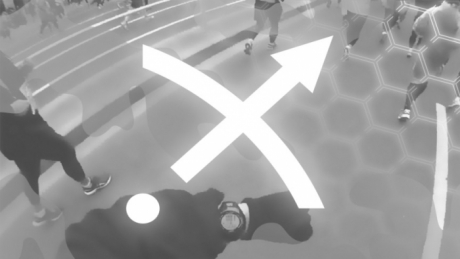
The archetypical form of the Hexagon appears in several fields which connect to the festival theme.
1. The strongest contemporary reference of the hexagon is its use in popular sport/fashion. A symbol for performance & strength.
2. Obviously the link to nature is given as well (bee sting), which works quite well in the post-utopian world of CAPTURE ALL.
3. Not to forget the aperture of a camera, which seems to be hexagonal as well.
Sport
Nature
Technology
The Waterfall
The waterfall stands as a picture for the endless stream of data. In asian mythology it is used quite a lot, loaded with the idea of power and beauty.
The Camouflage
transmediale asks for strategies to prevent the total quantification of life: the CAPTURE ALL situation. The design reflects this idea of hiding information (etc.) by using subtly camou-details.
The Typeface
Two typeface decisions create the CAPTURE ALL look.
1. The CAPTURE ALL typelogo is inspired by science fiction movie titles as well as chinese letters (outline style). The aim was to let it look like an evil company.
2. To enhance the sporty feeling we used Helvetica Extended which actually gives a strong power move to the whole design (see especially the layout of the magazine)
The Logo
The logo of this issue (arrow pointing to the right top) is a symbiosis of the WIFI icon and a bow & arrow (association to hero cult).
The CAPTURE ALL copytext was developed in cooperation with artist Hanne Lippard. By using and playing with catch phrases of our quantified life the festival theme became more definite, created the narrative by tracing back the keywords to daily phenomena.
The festival trailer was probably the most successfull communication tool. Together with video director Martin Kohout, writer Hanne Lippard and composer Giacomo Gianetta, The Laboratory of Manuel Bürger created a strange CAPTURE ALL vision.
Festival design by The Laboratory of Manuel Bürger

